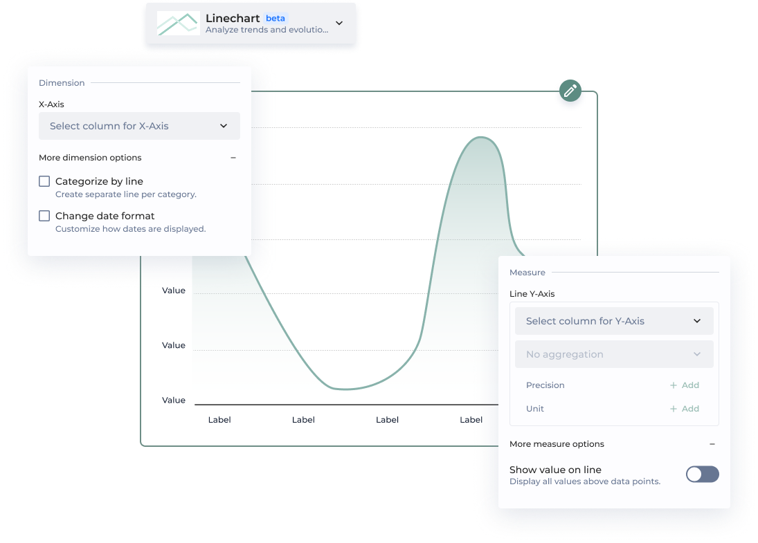

Precision determines the level of detail in how your values are displayed. By default, measures use a .2f format, meaning they are shown with two decimal places.
Example:
A value of 3.14159 will be displayed as 3.14 when using .2f formatting.
You can use four different sentiment statuses (positive, warning, negative, and neutral) to create colored background areas by setting a minimum and maximum value, enhancing visual clarity. There are no limits to the number of color zones you can add.
Note: Sentiments can be customized in the app theme.
| | | Enable color gradient | Configure the color gradient to adjust the intensity of a single color, enhancing visual depth and emphasis. | | {% endtab %} | | | {% tab title="Legacy Linechart" %} *New Chart Design* \***Mandatory parameters** | Section | Option | Configuration Tutorial | | --------------- | ----------------------------------------- | ----------------------------------------------------------------------------------------------------------------------------------------- | | | Dataset\* | Select the dataset used by the chart | | | X Axis\* | Your value for the X Axis | | | Y Axis\* | Your value for the Y Axis | | Multi-linechart | Series label | Display label based on column containing lines name | | Enrich chart | Color zones | Add colored zones. You can add multiple zones one by one | | Enrich chart | Color Zones - Min And Max Value | Enter the minimum and maximum value of your colored zone based on whether a fixed value, from a column or a dynamic value | | Enrich chart | Color Zones - Choose a sentiment color | Choose what color will be displayed in the zone, you can change color coding in the **Color Scheme** menu | | Ticks format | X axis date format | Customize the date display on the X AXis. Use [d3 time format](https://github.com/d3/d3-time-format#api-reference) for this ex. %Y-%m-%d. | | Display | Show all values on line | Display all the values on your linechart. This is not recommended because of display issues that may cause | | Display | Toggle gradient | By default the toggle is activated so that your line chart gets a color gradient | | {% endtab %} | | | {% tab title="New vs. Legacy Configuration" %} | **⭐️ New** | **Legacy** | | ----------------------- | ----------------------- | | **X-Axis** | X axis | | Categorize by line | Multi-line chart | | Change date format | Custom date tick format | | **Line Y-Axis** | Y axis | | Show value on line | Show all values on line | | Add complementary value | Additional info | | Add user chart guide | Tutorial | | Add color zones | Color zones | | Enable color gradient | Toggle gradient | | {% endtab %} | | | {% endtabs %} | |