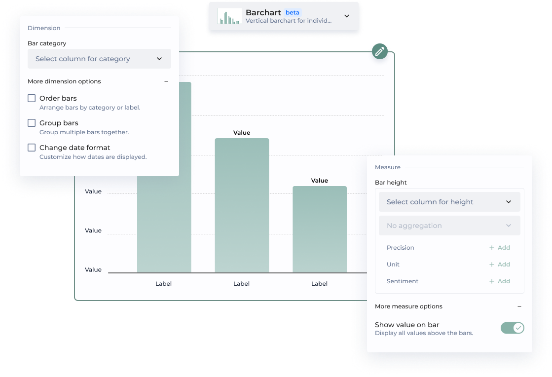

This option allows to order bars either by column or by custom value.
By column
Bars are ordered based on the selected column. By default, they follow an ascending order—starting with numerical categories, followed by alphabetical (A-Z). This order can be reversed.
By custom value
Bars are ordered based on the selected measure. For example, if the category is 'October' and the bar height is '10', you need to set the value to 10 for this bar to appear first.
| | | Group bars | Bars are grouped by category. For example, product types tracked monthly over a long period can be grouped by year. | | | Change date format | You can change the display format by selecting an option from the dropdown. Common D3 formats are suggested. *Note: Your column must be in a date format for this option to work.* | | **Measure** | | | | | Bar height | The bar height represents a value from your dataset. You can select an aggregation method from the menu, which may vary depending on the chart type. | | | Precision |Precision determines the level of detail in how your values are displayed. By default, measures use a .2f format, meaning they are shown with two decimal places.
Example:
A value of 3.14159 will be displayed as 3.14 when using .2f formatting.
Four different sentiment statuses (positive, warning, negative, neutral) can be used to color bars, enhancing visual distinction.
Note: Sentiments can be customized in the app theme.
| | | Show value on bar | Displays all values above the bars for easy visibility. | | **Additional parameters** | | | | | ID | Unique chart Id | | | Add complementary value | The complementary value is displayed in the data label, providing additional context and making it easier for viewers to interpret the data at a glance. It is possible to add a precision, an unit and a sentiment. | | | Add user chart guide | Lead your chart viewers through the narrative of your data. | | **Chart performance** | | Technical performance | **Style Configuration** | | Option | How does it work? | | ------------ | ------ | ---------------------------------------------------------------- | | **Theme** | | | | | Bars | Customize the bar color to align with your branding preferences. | | {% endtab %} | | | {% tab title="Legacy Barchart" %} This page provides a step-by-step guide for creating a barchart using the legacy design. \***Mandatory parameters**| Section | Option | Configuration tutorial |
|---|---|---|
| Dataset* | Select the dataset used by the chart | |
| Label* | this will define the name of each of the bars you want to display. Select the column containing bar label | |
| Value* | Select the column containing the value | |
| Heatbar - by using Sentiments | Add a heat bar to highlight variation/evolution of different categories by using sentiments (add-units-precisions-and-sentiments) | |
| Heatbar - with custom labels (code mode) | Switch in code mode and add a labels array to the sentiment configuration. The values of the labels array will be matched with the values of the range array. | |
| Legend | Display legend | Toggle to activate legend display |
| Legend | Default bar selected | Choose the first, last or the name of the label |
| Legend | Additional info | Add another column for more information on the legend |
| Sort | Bars order - Configuration type | Use it to order bars |
| Groups | Groups | This option let you group multiple columns together Select a column containing grouping of bars |
| Groups | Groups order | Use it to order groups |
| Groups | Groups additional info | Add another column for more information on the group |
| Display | Display all values on top of bars | Tick to display values on top of bars |
| Display | Scroll graph to the right | Tick to change the animation when arriving on the chart |
| Display | Scale | Use it to define the bars scale. Choose 2 bounds if you’re displaying %, try a 0 to 100 |
| Display | Disable zoom in animation | The chart will be zoomable, but will not transition to a zoomed state. All bars will remain visible. |
| Display | Disable zoom | he chart will not be zoomable. All bars will remain visible. |
| Display | Recycle group colors | Reuse groups color when chart data changes (filters or requesters). Note: groups must be setup, see Groups section |
| Display | Custom date tick format (for date labels) | This option lets you display your dates just the way you want. Insert d3 time format (.i.e. ‘%Y’ to display just years.) |
| Display | Size | Enter a proportion of the total screen Use on multiple charts onlyEnter a number from 0 to 1 |
| Display | Mobile size | Enter a proportion of the total mobile screen. Use on multiple charts onlyEnter a number from 0 to 1 |
| Display | Custom CSS class | amazing-class | Set a custom CSS class to target this specific chart with CSS |
| Tutorial | ID | Enter an ID. Change the ID to display the tutorial again. All tutorials with the same ID will be displayed only once. |
| Tutorial | Message | Enter your message | This will be displayed to your users |
| Tutorial | Always show this tutorial | By default the tutorial is shown once only |
| ⭐️ New | Legacy |
|---|---|
| Bar category | Label |
| Order bars | Bars order - Configuration type |
| Group bars | Groups |
| Change date format | Custom date tick format |
| Bar height | Value |
| Show value on bar | Display all values on top of bars |
| Add complementary value | Additional info |