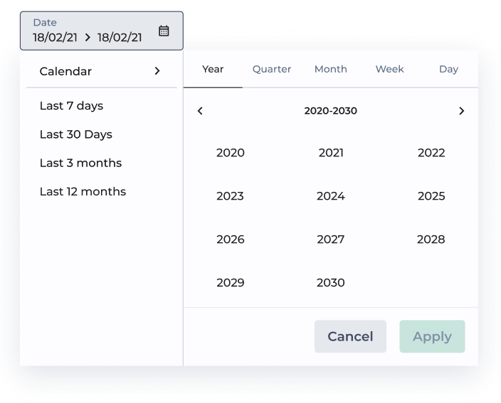
# Date Range
When the filter is tied with those elements, the user will be able to filter dates specific dates, date ranges, or even preset dates. It's a super important axis for storytelling.
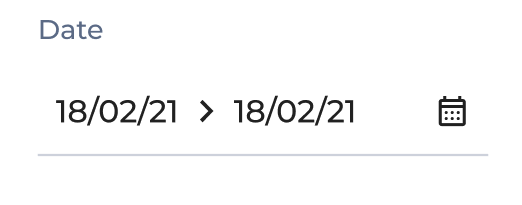
Date Range - in-header style
### Configuring Period Types
You can select all the period types relevant to your app’s storytelling needs.
By default, you will see only days. You can also enable and disable:
* Days
* Weeks
* Months
* Quarters
* Years
Each of these period types comes with formatting options.
> Note that the format and language depends on your app language - for now, only English, French and Spanish are available.
### Configuring Date Limits
Date limits represent the bounds of the selectable dates. Configuring “date limits” will limit the visibility of the calendar for an End User selecting dates and date ranges.
Let’s say you have 5 years of history and you want to limit your user selection to the last 3 years. You can set the **date limits** so users will only be able to select dates within the last 3 years.
You can configure date limits through different methods:
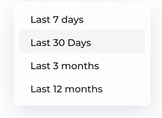
* Using **preset date ranges** (that we have prepared for you). You will see them appearing on the left of the “Date Limit” configuration panel:
preset date ranges
* Using **relative dates**: define an interval from/until a reference date. Do this by selecting a *number*, a *period type*, *from/until,* and a *reference date* (today, yesterday…)
relative dates
Note that the from/until operators are inclusive, e.g. until “Today” will include today.
* Using **fixed dates** on a calendar:
Note that currently, you can only have multiple selections in the “Days” tab.
### Configuring Custom Periods
“Custom periods” are a nice way for you to add pre-selected date ranges that are relevant to your business.
Let’s say you are working in retail: you can create a date range called “Black Friday 21”, that users will be able to select easily.
* To do so, you can click on “Add custom range”:
*
```
Add custom range
```
* Give a name to your custom range and configure it by using “Preset Dates”, “Relative Dates” or “Fixed Dates” (this is the same user experience as in “Date Limits”, see above).
You can also delete (clicking on the bin icon) or modify (clicking on the “+” icon) already set custom periods.
### Configuring a Default Value
The **default value** is the default selection appearing when users login to the app for the first time. The default value is also displayed when users empty the selection they made.
As an App Builder, you will be able to select between custom periods (see above), or preset values that we have picked for you.
You can check the video in the “Custom Periods” paragraph to see how to configure this.
Date Range - in-story style
## Templating
More information on templating capabilities in [this page](https://docs-v3.toucantoco.com/visualizations-and-layouts/apps/templating-from-filters-values#date-range-filters-case).
## Information
In the "Information" section, you can retrieve filter properties, such as the id, useful for Templating (cf. [Templating from Filters' values](https://docs-v3.toucantoco.com/visualizations-and-layouts/apps/templating-from-filters-values#start))
| Option | Description |
| ------- | ------------------------------------------------------------------------------ |
| id | Unique identifier of the Filter |
| dataset | Source dataset |
| column | Column from which filter's values comes from. (The column's type must be date) |
.png?alt=media)
.png)