
Precision determines the level of detail in how your values are displayed. By default, measures use a .2f format, meaning they are shown with two decimal places.
Example:
A value of 3.14159 will be displayed as 3.14 when using .2f formatting.
Four different sentiment statuses (positive, warning, negative, neutral) can be used to color bars, enhancing visual distinction.
Note: Sentiments can be customized in the app theme.
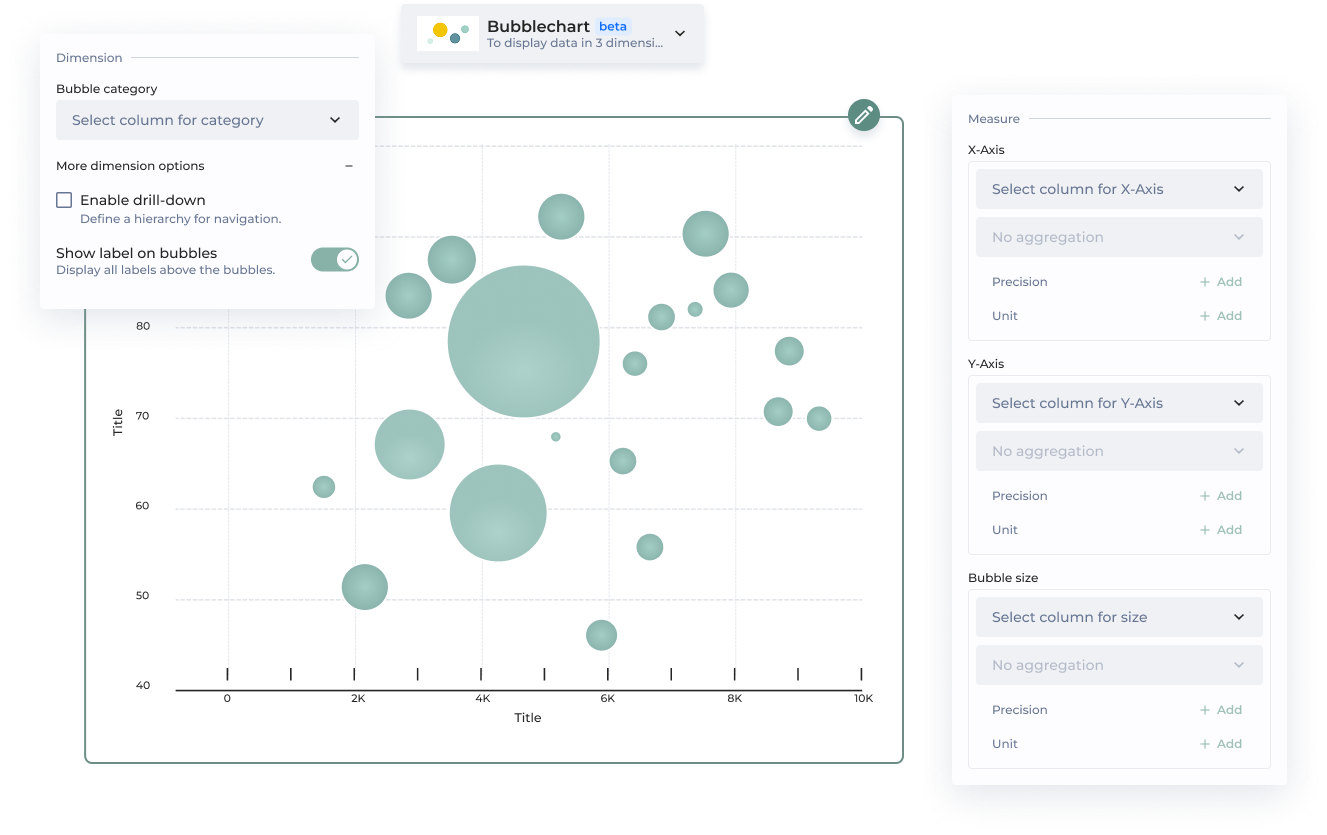
| | | Set bubble size | Adds a third dimension to the chart to visually represent an additional measure such as volume, count, or revenue. | | **Additional parameters** | | | | | ID | Unique chart Id | | | Add complementary value | The complementary value is displayed in the data label, providing additional context and making it easier for viewers to interpret the data at a glance. It is possible to add a precision, an unit and a sentiment. | | | Add user chart guide | Lead your chart viewers through the narrative of your data. | | **Chart performance** | | Technical performance | **Style Configuration** | | Option | How does it work? | | ------------ | -------------- | -------------------------------------------------------------------------------------------------- | | **Bubbles** | | | | | Bubbles | Customize the bubble color to align with your branding preferences. | | | Bubble opacity | Controls the transparency of bubbles to reduce visual clutter and support overlapping data points. | | {% endtab %} | | | {% tab title="Legacy Bubblechart" %} This page provides a step-by-step guide for creating a barchart using the legacy design. \***Mandatory parameters**| Section | Option | Configuration tutorial |
|---|---|---|
| Dataset* | Select the dataset used by the chart | |
| X axis* | Column containing x axis value | |
| Y axis* | Column containing y axis value | |
| Legend | Display legend | Toggle to activate legend display |
| Legend | Additional info | Add another column for more information on the legend |
| Legend | Default selected bubble | Choose the first, last or the name of the label |
| Legend | Display a color gradient legend | Toggle to display a color gradient legend |
| Legend | Modify gradient color | Enter the min and max color (HEX (‘#…’) code) |
| Drill | Drill | The first bubble you see is the parent bubble. Click on it to see it’s children |
| Drill | Level | Column containing parent or child level information |
| Drill | Group | Column containing the name of the parent bubbles to group them |
| Drill | Levels order | Enter the value of the parent bubbles as the 1st entry and the level value of the child bubbles as 2nd entry |
| Colored Zone | Quadrants | Divide your bubble chart in 4 colored zones |
| Colored Zone | Quadrants - Configuration type | Select the configuration type for quadrant:
|
| Colored Zone | Quadrants - X | Column containing x axis value |
| Colored Zone | Quadrants - Y | Column containing y axis value |
| Colored Zone | Color coding | Add a color coding in the zones Input Order (4 max): top left, top right, bottom left, bottom right |
| Colored Zone | Quadrant legend | Add a legend in the zones Input Order (4 max): top left, top right, bottom left, bottom right |
| Colored Zone | Bisector | Divide your chart in 2 zonesDon’t forget to add a color coding and a legend! |
| Colored Zone | Bisector X axis | Column containing x axis value |
| Colored Zone | Bisector Y axis | Column containing y axis value |
| Colored Zone | Bisector - Color coding | Add a color coding in the zones Input Order (2 max): top left & bottom right |
| Colored Zone | Bisector - Zones legend | Add a legend in the zones Input Order (2 max): top left & bottom right |
| Enrich Chart | Bubble size | Column containing bubble size value |
| Enrich Chart | Bubble color | Column containing bubble color value/category: it can be a number or a text |
| Enrich Chart | Line | Add a line on top of your bubble chart to display an average, an objective of revenue... |
| Enrich Chart | Line - X axis | Column containing x axis value |
| Enrich Chart | Line - Y axis | Column containing y axis value |
| Display | Display bubbles' values | Toggle to display the value on the bubbles |
| Display | X axis scale | Use it to define the scale for the X axis: choose 2 bounds (if you’re displaying %, use bounds between 0 and 100) |
| Display | Y axis scale | Use it to define the scale for the Y axis: choose 2 bounds (if you’re displaying %, use bounds between 0 and 100) |
| Display | Bubble size scale | Use it to define the bubbles size scale: choose 2 bounds (if you’re displaying %, use bounds between 0 and 100) |
| Display | Overwrite default bubble's opacity | |
| Display | Recycle bubbles colors | Reuse bubbles color when chart data changes (filters or requesters). |
| Display | Zoom | Toggle to enable zoom |
| Display | Overwrite the default min and max zoom of [1, 5] | Input a value from 1 to 5 to set a default zoom on the chart |
| Display | Size | Enter a proportion of the total screen (a number from 0 to 1) Use on multiple charts only |
| Display | Mobile size | Enter a proportion of the total mobile screen (Use on multiple charts only): enter a number from 0 to 1 |
| Display | Custom CSS class | Set a customm CSS class to target this specific chart with CSS |
| Tutorial | ID | Enter an ID. Change the ID to display the tutorial again. All tutorials with the same ID will be displayed only once. |
| Tutorial | Message | Enter your message. This will be displayed to your users |
| Tutorial | Always show this tutorial | By default the tutorial is shown once only |