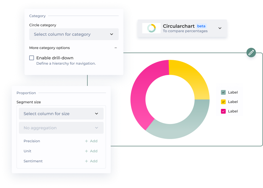

| Option | How does it work? | |
|---|---|---|
| Category | ||
| Circle category | The circle category corresponds to a column in your dataset, such as 'Product Type'. | |
| Enable drill-down | Allows users to interactively click on a chart segment to reveal deeper data layers or subcategories. | |
| Proportion | ||
| Segment size | Select the aggregation to use, and the column on which the aggregation will be applied | |
| Precision | Precision determines the level of detail in how your values are displayed. By default, measures use a Example: | |
| Unit | Unit represents the total quantity or category being measured for a KPI. It defines what the values correspond to, providing context for better interpretation. | |
| Sentiment | Four different sentiment statuses (positive, warning, negative, neutral) can be used to color bars, enhancing visual distinction. Note: Sentiments can be customized in the app theme. | |
| Additional parameters | ||
| ID | Unique chart Id | |
| Add complementary value | The complementary value is displayed in the data label, providing additional context and making it easier for viewers to interpret the data at a glance. It is possible to add a precision, an unit and a sentiment. | |
| Add user chart guide | Lead your chart viewers through the narrative of your data. | |
| Chart performance | Technical performance |
| Section | Option | Configuration tutorial |
|---|---|---|
| Dataset* | Select the dataset used by the chart | |
| Label* | Select the name of the column containing the labels | |
| Value* | Select the aggregation to use, and the column on which the aggregation will be applied | |
| Legend | Display legend | Click on the toggle |
| Legend | Segment selected by default |
|
| Legend | Additional info | Select the column columns that will be displayed in the legend |
| Drill | Drill |
|
| Display | Size | (Used only for multiple charts) Enter a proportion of the total screen between 0 and 1 |
| Display | Max number of arcs per level | Enter the maximum number of arcs to be displayed (The arcs that exceed this number will be squashed in a single arc named Others) |
| Display | Mobile size | (Used only for multiple charts) Enter a proportion of the total screen between 0 and 1 for mobile screens |
| Display | Custom css class | Set a custom CSS class to target this specific chart with CSS |
| Tutorial | ID | Enter an ID Change the ID to display the tutorial again All tutorials with the same ID will be displayed only once |
| Tutorial | Message | Enter your message. This will be displayed to your users. |
| Tutorial | Always show this tutorial | By default the tutorial is shown once only. |