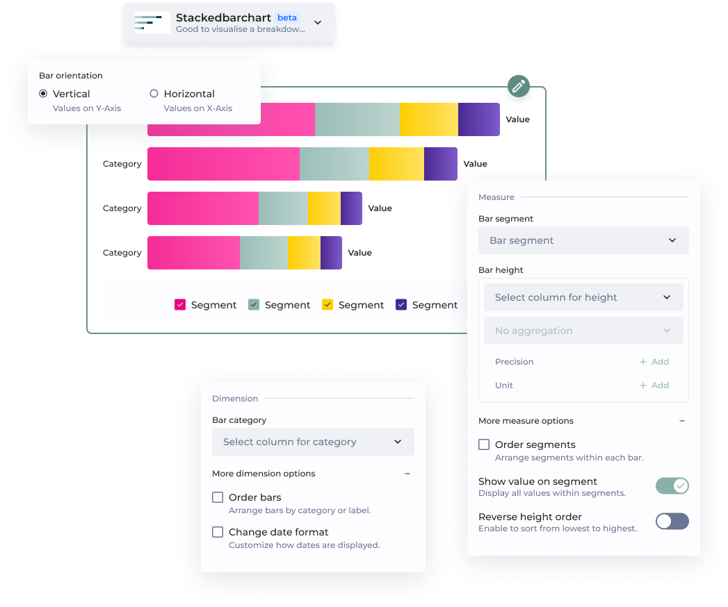

This option allows to order bars either by column or by custom value.
By column
Bars are ordered based on the selected column. By default, they follow an ascending order—starting with numerical categories, followed by alphabetical (A-Z). This order can be reversed.
By custom value
Bars are ordered based on the selected measure. For example, if the category is 'October' and the bar height is '10', you need to set the value to 10 for this bar to appear first.
| | | Change date format | You can change the display format by selecting an option from the dropdown. Common D3 formats are suggested. *Note: Your column must be in a date format for this option to work.* | | **Measure** | | | | | Bar segment | The bar segment represents a subcategory within each bar, corresponding to a column in your dataset—for example, 'Region' or 'Status'. Each segment stacks within the main bar to show how the total value is divided among its parts. | | | Bar height | The bar height represents a value from your dataset. You can select an aggregation method from the menu, which may vary depending on the chart type. | | | Precision |Precision determines the level of detail in how your values are displayed. By default, measures use a .2f format, meaning they are shown with two decimal places.
Example:
A value of 3.14159 will be displayed as 3.14 when using .2f formatting.
This will define the name of each of the bars you want to display.
Select the column containing bar label
| | | Groups**\*** | Your groups of choice | | | Value**\*** | Select the column containing the value | | Legend | Display Legend | Toggle to activate legend display | | Legend | Default selected bar | Choose the first, last or the name of the label | | Legend | Additional info | Add another column for more information on the legend | | Sort | Sort bars | Use it to order bars | | Sort | Labels order | Use it to order labels | | Sort | Groups order | Use it to order groups | | Groups | Groups additional info | Add another column for more information on the group | | Packs (Horizontal Display Only) | Packs | Group labels together based on a column | | Packs (Horizontal Display Only) | Packs order | Order pack based on a column, on an advanced order or a custom order | | Packs (Horizontal Display Only) | Display packs names | Toggle to display packs names | | Lines (vertical display only) | X axis | Use to choose X axis same as bar labels | | Lines (vertical display only) | Y axis | Use to choose Y axis | | Lines (vertical display only) | Smooth line | Toggle to interpolate between poinfs | | Lines (vertical display only) | Show all values on line | Toggle to show all values on line | | Lines (vertical display only) | Use same scale for bars and lines | Toggle to use same scale for bars and lines | | Enrich chart | variation | Add a variation in your data with your evolution values | | Enrich chart | URL link | Add url link to bars label | | Display | Custom Date format (for date labels) |This option lets you display your dates just the way you want.
Insert d3 time format (.i.e. ‘%Y’ to display just years.)
Enter an ID.
Change the ID to display the tutorial again.
All tutorials with the same ID will be displayed only once
| | Tutorial | Enter a message | Enter your message \| This will be displayed to your users | | Tutorial | Always show this tutorial | By default the tutorial is shown once only | | {% endtab %} | | | {% tab title="New vs. Legacy Configuration" %} | **⭐️ New** | **Legacy** | | ----------------------- | ----------------------- | | **Bar category** | Label | | Order bars | Labels order | | Change date format | Custom date tick format | | **Bar segment** | Groups | | **Bar height** | Value | | Order segments | Groups order | | Reverse segment order | | | Show value on segment | Display all values | | Reverse height order | Sort bars | | Add complementary value | Additional info | | Add user chart guide | Tutorial | | {% endtab %} | | | {% endtabs %} | |