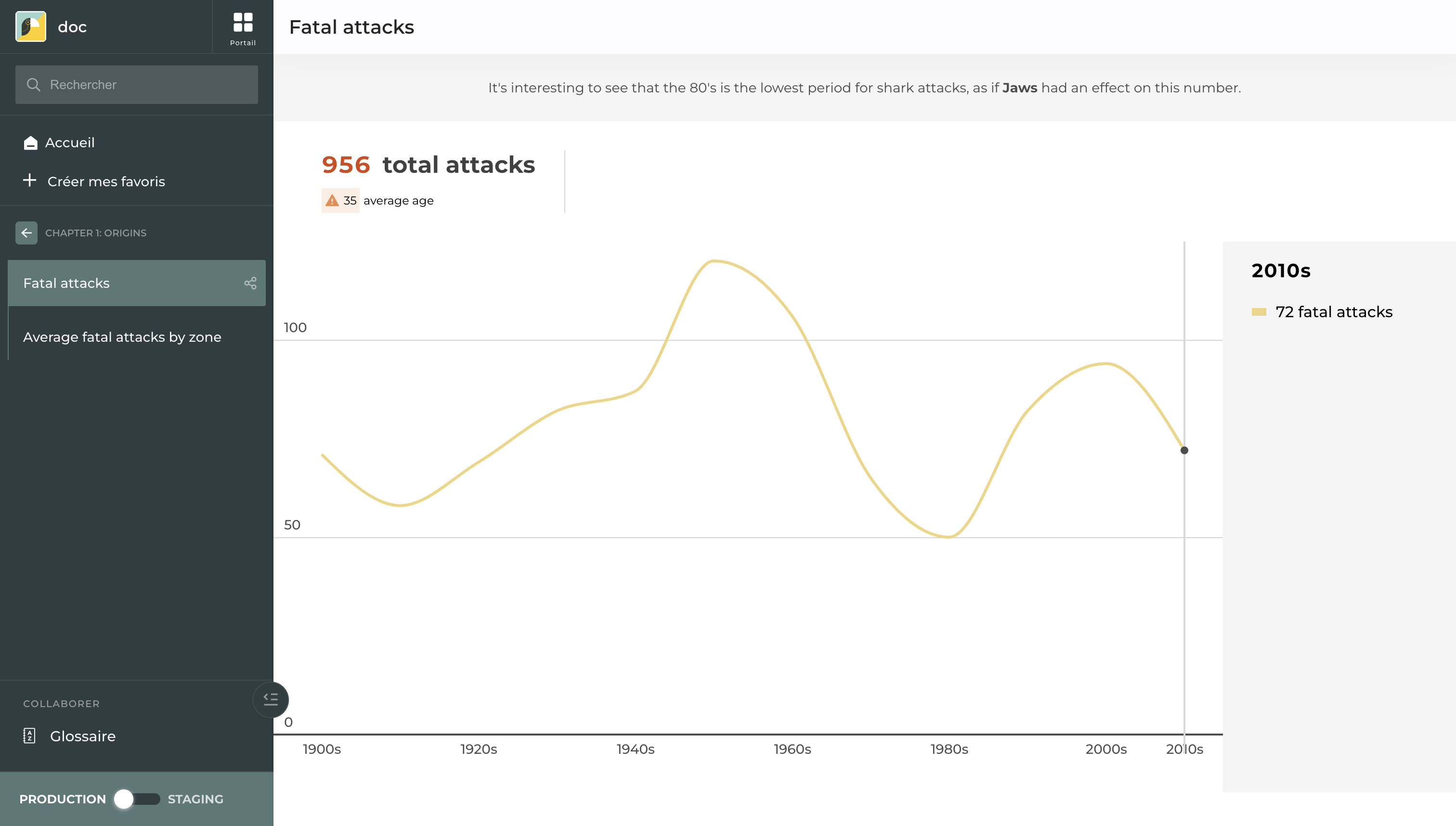
A story including a KPI

A story including a KPI
| Section | Option | Configuration tutorial |
|---|---|---|
| Dataset (mandatory) | Select the dataset used by the KPI | |
| Value (mandatory) | Choose the column name containing the value to display | |
| Text (optional) | Add a text to contextualize your KPI | |
| Other options | Badge | Tick to be able to add context such as an additional value or an evolution |
| Other options | Badge - Value | Column name containing the badge value. Define its and linked symbol. Default to up/own arrow. |
| Other options | Badge - Text | Add a text to contextualize your badge |
| Other options | Icons choices | Pick an icon to highlight the related sentiment. Important: configure a sentiment before choosing an icon (add-units-precisions-and-sentiments) |
| Other options | Reverse display order | Toggle to display first the text and then the value |