" flowId="OJ5SndpjBBzcogs77CzZ" %}
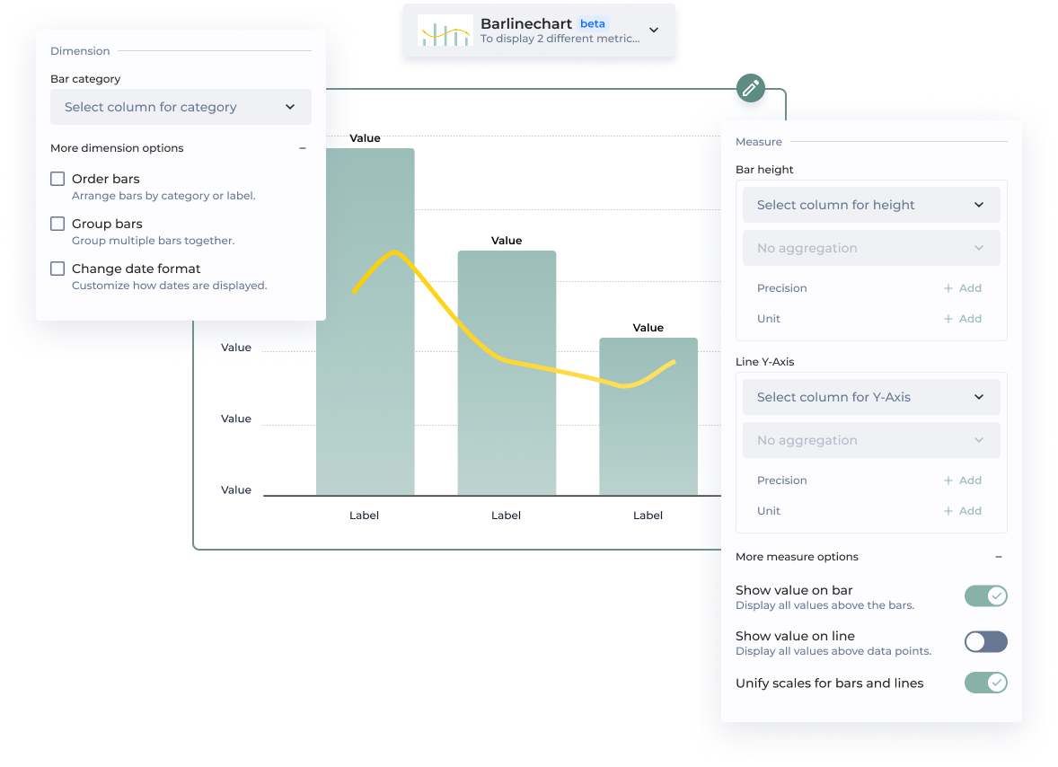
**Chart Configuration Step-by-Step**
| | Option | How does it work? |
| ------------------------- | ------------------------------- | ------------------------------------------------------------------------------------------------------------------------------------------------------------------------------------------------------------------------------------------------------------------------------------------------------------------------------------------------------------------------------------------------------------------------------------------------------------------------------------------------------------------------------ |
| **Dimension** | | |
| | Bar category | The bar category corresponds to a column in your dataset, such as 'Product Type'. |
| | Order bars | This option allows to order bars either by column or by custom value.
By column
Bars are ordered based on the selected column. By default, they follow an ascending order—starting with numerical categories, followed by alphabetical (A-Z). This order can be reversed.
By custom value
Bars are ordered based on the selected measure. For example, if the category is 'October' and the bar height is '10', you need to set the value to 10 for this bar to appear first.
|
| | Group bars | Bars are grouped by category. For example, product types tracked monthly over a long period can be grouped by year. |
| | Change date format | You can change the display format by selecting an option from the dropdown. Common D3 formats are suggested. *Note: Your column must be in a date format for this option to work.* |
| **Measure** | | |
| | Bar height | The bar height represents a value from your dataset. You can select an aggregation method from the menu, which may vary depending on the chart type. |
| | Line Y-Axis | The Y-Axis represents a value from your dataset. You can select an aggregation method from the menu, which may vary depending on the chart type. |
| | Precision | Precision determines the level of detail in how your values are displayed. By default, measures use a .2f format, meaning they are shown with two decimal places.
Example:
A value of 3.14159 will be displayed as 3.14 when using .2f formatting.
|
| | Unit | Unit represents the total quantity or category being measured for a KPI. It defines what the values correspond to, providing context for better interpretation. |
| | Show value on bar | Displays all values above the bar for easy visibility. |
| | Show value on line | Displays all values above the line for easy visibility. |
| | Unify scales for bars and lines | Ensure bars and lines share the same scale for accurate comparison and clear visualization. |
| **Additional parameters** | | |
| | ID | Unique chart Id |
| | Add complementary value | The complementary value is displayed in the data label, providing additional context and making it easier for viewers to interpret the data at a glance. It is possible to add a precision, an unit and a sentiment. |
| | Add user chart guide | Lead your chart viewers through the narrative of your data. |
| **Chart performance** | | Technical performance |
**Style Configuration**
| | Option | How does it work? |
| ------------ | -------------- | ------------------------------------------------------------------------- |
| Theme | | |
| | Bars and lines | Customize the bar and line color to align with your branding preferences. |
| {% endtab %} | | |
{% tab title="Legacy Barlinechart" %}
*New Chart Design*
\***Mandatory parameters**
| Section | Option | Configuration tutorial |
| ------------ | -------------------------------------------- | ---------------------------------------------------------------------- |
| | Dataset\* | Select the dataset used by the chart |
| | Bars Label\* | Select the column containing the label of bars |
| | Bars Value\* | Select the column containing the value of bars |
| Bars | Bars groups | Select the column containing the name of the parent bars to group them |
| Bars | Show all bar values | Displays values on top of bars. Activated by default. |
| Lines | Y axis\* | Select the column name containing y axis values |
| Sort | Labels order | Order labels based on a column, an advanced order or a custom order. |
| Display | Use same scale for bars and lines | Enhance readability of barlinecharts |
| {% endtab %} | | |
{% tab title="New vs. Legacy Configuration" %}
| **⭐️ New** | **Legacy** |
| --------------------------- | --------------------------------- |
| **Bar category** | Bars label |
| Order bars | Labels order |
| Groups bars | Bars groups |
| Change date format | Custom date tick format |
| **Bar height** | Bars value |
| **Line Y-Axis** | Y axis |
| Show value on bar | Show all bar values |
| Show value on line | Show all values on line |
| Unify scales bars and lines | Use same scale for bars and lines |
| Add complementary value | Additional info |
| Add user chart guide | Tutorial |
| {% endtab %} | |
| {% endtabs %} | |

